By Joseph Wheeler, 8/6/2014. Nazdeek is currently involved with an ongoing campaign to increase the minimum wage on tea plantations in Assam, India. Due to colonial-era wage policies, tea corporations have been able to pay workers only 94 rupees per day, roughly $1.57 USD. Nazdeek has done significant work and research in this area and they hoped to develop an infographic to raise awareness about this ongoing injustice.
I started by catching up on the research Nazdeek had already produced and found an interesting comparison of wages in Assam tea gardens compared to wages in Kerala–another major tea producer in India. Workers in Kerala earn roughly 3 times workers in Assam. This drastic differential in income gave me the idea to produce an infographic that would place daily wages side-by-side to show audiences how much less Assamese tea garden workers were receiving, while simultaneously highlighting the fact that tea garden workers in Assam earn less than state minimum wage. Here are some initial concept sketches:
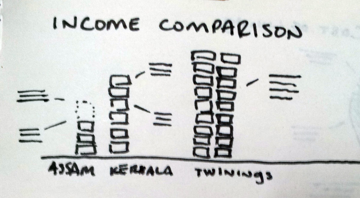
I then it would be very powerful to visualize the difference in income with actual stacks of money (or at least icons of the rupees), imitating the visual language of the viral motion graphic Wealth Inequality in America.
My concept then developed into this simple bar graph, built up with stacks of rupees, to display the difference in income. Also, since this graphic was to be disseminated to an international audience, I wanted to ground the comparison to something familiar to the average western consumer. I thought placing the cost of a package of Twinings tea, sourced from the gardens in Assam, might shock viewers into understanding the gravity of this income disparity.
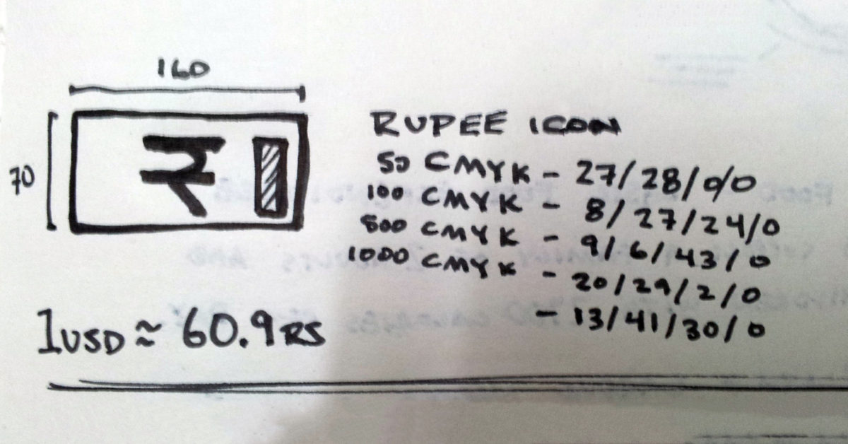
My next step was to design the rupee icon that would build the majority of this graphic. I needed something that was recognizable, but simple enough to not distract from the graphic itself–since there would be dozens of these icons stacked in each column anything too complicated would cause eye strain. Color was the most important aspect to make the rupees simple but immediately recognizable.
With the rupees designed, the first draft of the graphic came together nicely, but the colors were too bright (it was looking a little like monopoly money). I also wanted to include a little more information about the issue, and the folks at Nazdeek wanted to more overtly highlight the fact that tea workers in Assam were earning less than the minimum wage.
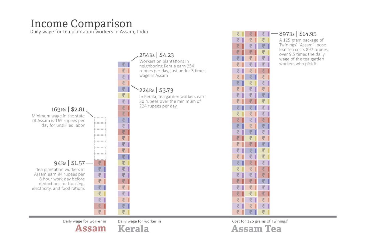
I was able to tone down the colors, and make the rupees look a little more distinct, by adding a hue of the orange-brown clay color that cover everything in India, and stains most notes. I added the minimum wage call-outs as Nazdeek requested, and included a blurb about the social issue context. I also added a legend to help with legibility and identify the exchange rate used to produce the graph.
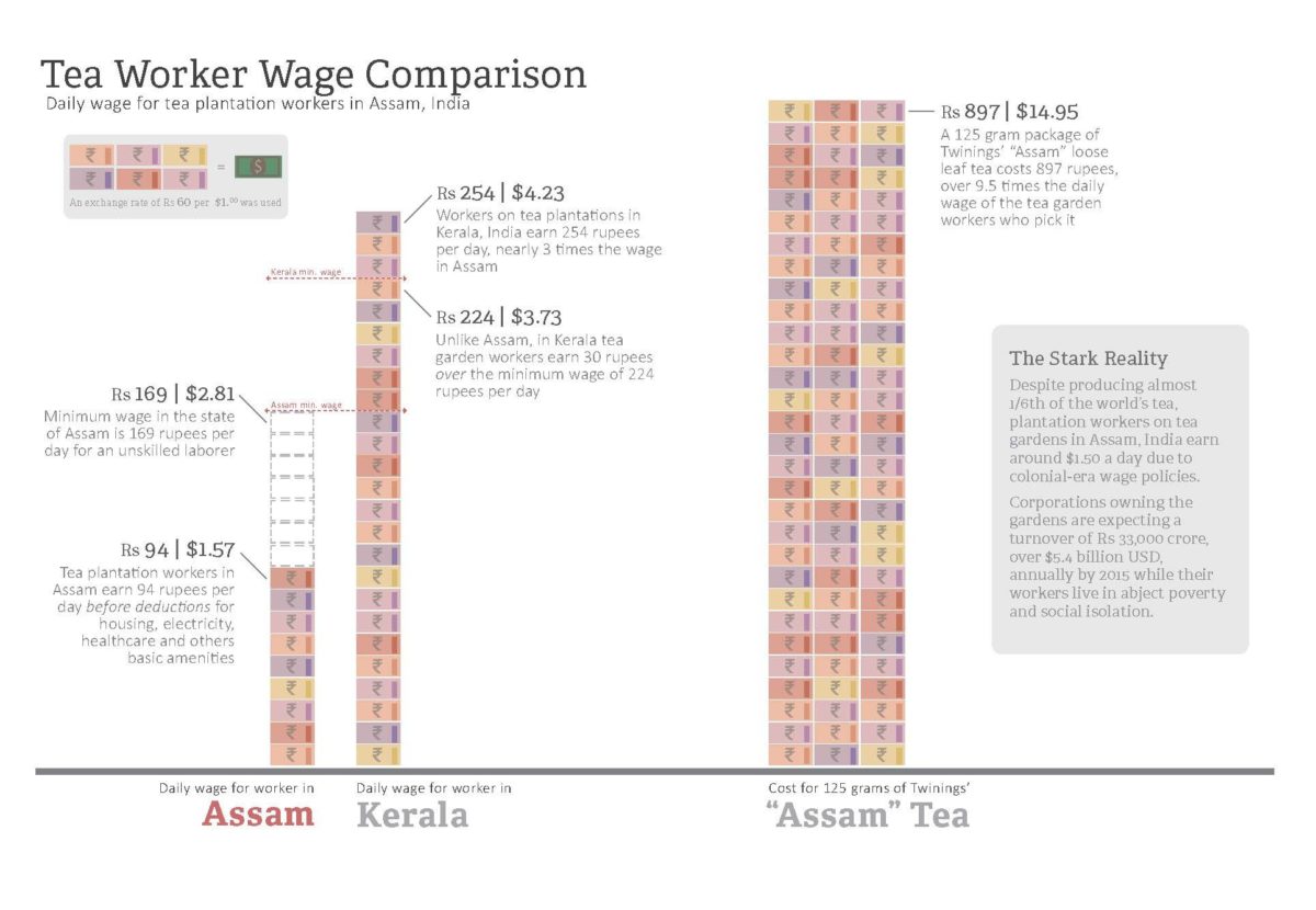
Overall, I am very pleased with how the final draft came out. (View the full resolution graphic here: Income Comparison) We are hoping to reach out to news media outlets later this week with a series of other graphics and a write-up to try to get this information published and begin a discussion about increasing wage for workers in Assam.